

Arké
a UX/UI case study of an e-commerce mobile website
The brief
Arké is a shop specialized in the sales and distribution of floral essences and aromatherapy products mainly for professionals, but also for the general public.
Our task was to redesign a responsive website for Arké, focusing our efforts on organizing the information in a clear way for both the customers and the stakeholders.
Main deliverable
A hi-fidelity prototype of the mobile website
My Role
UX/UI Designer
UX Research, Information Architecture, Design System, UI Design, Prototyping

A bit about Arké
Arké is a shop specialized in the sales and distribution of floral essences and aromatherapy products mainly for professionals, but also for the general public.

Where does Arké stand?

It seems where Arké shines at is the great variety of products, but there are some things where competitors do a better job, especially online.
What are others doing better?
In order to understand the competitive landscape, we positionned Arké in the market to see where it stands.
This helped us identify their competitive advantage.

Insights from the shop owner

We interviewed the shop owner and asked him about the business, the motivations behind the shop and the goal they want to reach via their website.
This is their current website
What’s wrong?
confusing and overwhelming menu
messy and vibrating colors
bad contrasts
unclear photos and descriptions
vague value proposition
What customers think about their website
Most customers trust Arké a lot, but when it comes to shopping online most get a bit lost on the website.

We believe in facts backed up by data

Most access the website on mobile but it seems they leave shortly after they landed on the page, without taking any action.
The heuristics of the website

While we found many things that need to be fixed, we decided to focus on the following:
Inconsistency of products vs images
Information architecture
Aesthetics and design
We tested the website with some random users
We also wanted to see what other users think about the website while they see it and use it for the first time. Their reactions confirmed our analysis and theories, so we went straight to work.

Our reasearch led us to this problem statement:
Arké provides a wide range of specialised products on their website with a discount for professionals, but the products lack clear categorization, descriptions, and photos, and the discount for professionals is not clearly labeled, which is causing potential customers to abandon the website.
Angelina, our user persona

Goals
Help her clients
Use alternative medicine
Wants
Too buy all the products she needs in one place
Too gain new knowledge about alternative medicine
Frustrations
Living in a small town without access to specialized products
Overwhelming catalogue
Confusing product descriptions
Needs
Specific niche products
To save money
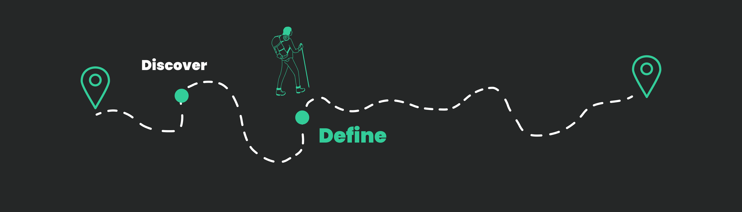
Angelina’s journey: a tale of disappointment


We started ideating
Our focus was on:
the information architecture of the website
a better visibility of Arke’s offer for professionals

The ideation technique that helped us a lot was Crazy 8s and we also used the card sorting technique to help us fix the information architecture issue
User Flow
We created some mid-fi wireframes for the following user flow:

Moodboard

When choosing our colors and typography we thought of:
nature
wellness
balance
elegance
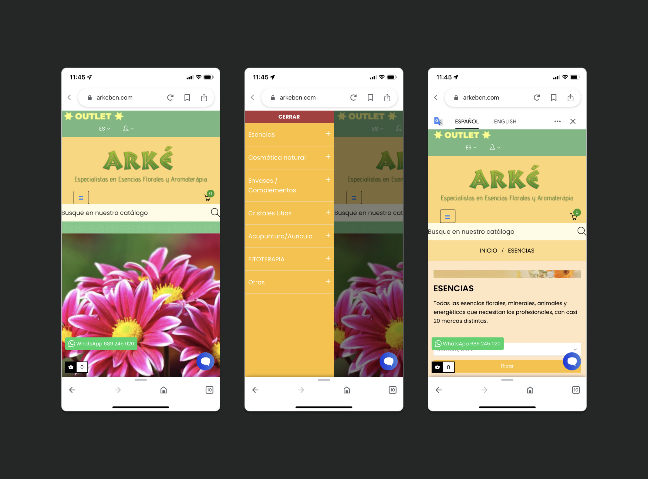
Low-fidelity to hi-fidelity after testing and iterations


The hi-fidelity wireframes

Key Learnings
It is really important to do research early and to talk to both business owners and real users to get meaningful insight.
Most times resources are limited and deadlines are tight
It’s exciting to include UI for the first time, but make sure you don’t skip ahead too much so it’s the right UI for the user
Consistency in design and content is essential to help the user navigate in an intuitive way.