
Tree Your Mind

a UX/UI design case study of a wellness app
The brief
Our task was to conduct user research to understand people’s relationship with mental, physical, and emotional well-being and create an MVP of an app that will motivate them to take action.
We created Tree Your Mind, a wellness app for nature lovers who don’t spend as much time in nature as they wish they did. It was inspired from the Shinrin-Yoku Japanese practice, also known as forest-bathing therapy.
Main deliverable
A hi-fidelity prototype of an iOS native app
My Role
UX/UI Designer
UX Research, Information Architecture, Design System, UI Design, Prototyping

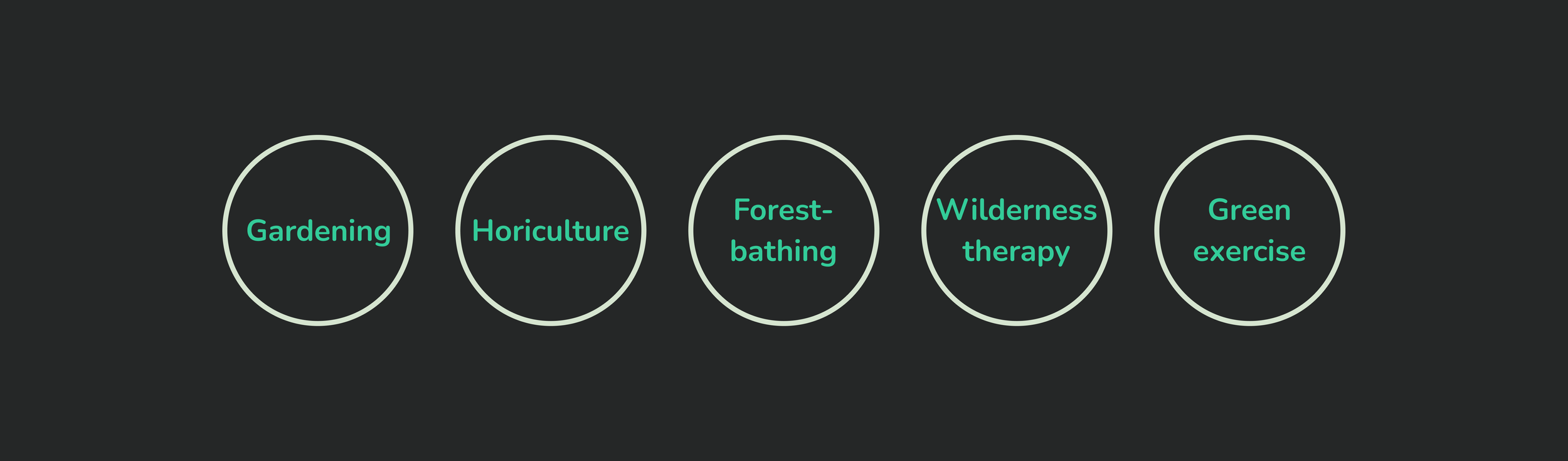
Ecotherapy - therapy through nature
We started by exploring ecotherapy which is a form of therapeutic treatment which involves doing outdoor activities in nature. Some examples are:

A 2018 meta-analysis of 143 studies showed an association between increased green space exposure and a decrease in cortisol (a stress hormone) in the saliva. This is only one of the many benefits it has.
Competitive landscape - looking at the big picture
While doing research to understand what other apps are doing in the ecotherapy space , we understood we should be looking at different categories:
Ecotherapy
Meditation
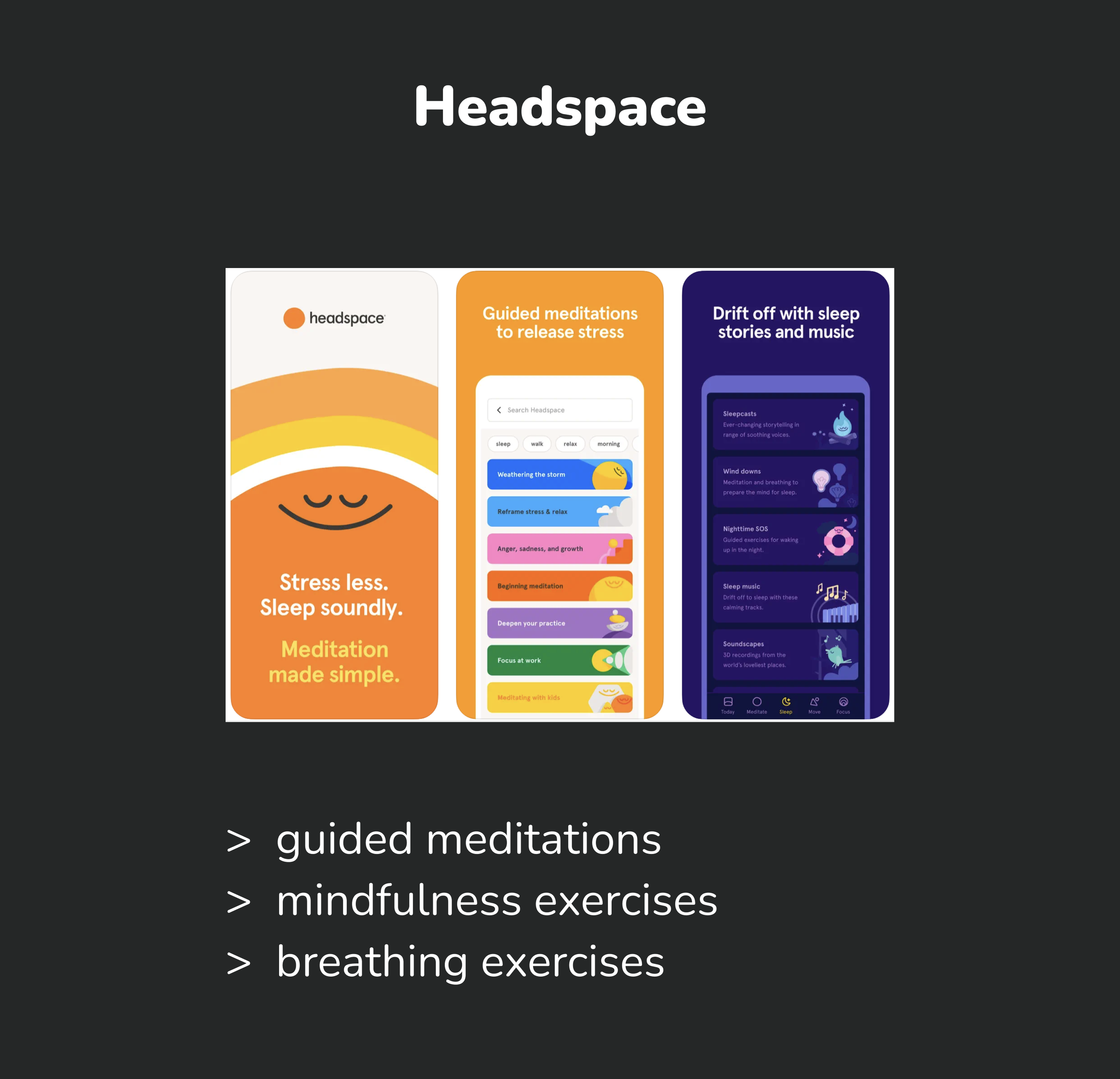


Social / Fitness /Travel
Understanding the potential users
Interviews


Survey
We got 82 responses to our survey and found that:
80%
live in a urban area
41%
feel stressed and tired lately
85%
feel more relaxed after being in nature

Empathy Map - we highlighted the main insights

Problem Statement
Full-time employed outdoors enthusiasts are trying to step away from the work routine and daily stress by spending more time in nature, but they have no time because they have a busy schedule at work. This makes them feel sad and frustrated.
User Persona


Journey Map
Ideation
We launched the brainstorming with “How might we” questions, which helped us a lot with the ideation process.
For idea generation we used a couple of different techniques such as: the worst idea and the crazy 8s.

We came up with around 40 different ideas and in order to prioritize them, we went with the Moscow method. The acronym MoSCoW represents four categories of initiatives: must-have, should-have, could-have, and won't-have.

Moodboard

We were looking to capture a sense of calmness and groundedness, while sticking to a friendly tone.
The Moodboard helped us carve our tone and voice by choosing the right colors, typography and shapes.
Style Guide

Colors
For colors we decided to go with different shades of green, as it is the best representation for the attributes of nature.
Typography
We used Nunito, as the geometric shape of the letters communicates simplicity and straight-forwardness with warmth.
Shapes
We used rounded corners for cards and buttons as they evoke warmth, trust, openness and a friendly tone.
Testing & iterations: Mid-fi to Hi-fi


Key Features

Other mockups & the prototype
Due to the time constraints of the project, we could only design one screen for the Web app and one screen for the Android native app.
When designing for the Web app, we took in consideration that Joana would mainly use it on desktop to check her profile, where she can see her mood tracker dashboard as well as events she is going to attend.

While “translating” the design to the Android platform, we noticed there are no considerable changes, but still some things to keep in mind for Android such as:
/ full search bar in top navigation
/ use of floating buttons
/ top of screen navigation

Key Learnings
Testing and iterating is really important in order to get the best possible version of the MVP
The design on the desktop app will differ to the one on mobile app, depending on what the user will do on each device
Consistency is key across different devices & systems, while keeping in mind the constraints for each