
Wikiloc
redesigning a hiking app

The brief
Redesign the main screens of the Wikiloc app, without the constraints of conducting user research. The app already had content and users, therefore the focus is on improving information architecture and visual design.
Main deliverable
main screens redesign
My Role
UX/UI Designer
Information Architecture, UI Design

What is Wikiloc?
Wikiloc is an app that I use when I go hiking in Spain. Wikiloc covers a wide range of possible trails due to users being able to upload their own trails.
The main tasks a user can accomplish on the Wikiloc app are:
record a trail and post it
find trails by activity type / location /other filters
download GPS tracks to follow the trail on a map
Heuristic analysis to see what’s not working

Within all findings, I decided to focus on the following problems:
Some UI elements are not according to the standards, e.g. icons are not recognizable
App is overcharged with non-essential UI elements
Use of colors doesn’t help the aesthetics of the app
What are others doing in the same space?
I did a visual competitive analysis to understand if there are any specific trends within the competitors, paying attention mainly to the visual aspect, UI elements used and also the information architecture.
The apps I looked at are:
Direct competitors: AllTrails & Komoot


Indirect competitors: Strava & Gaia GPS


This is the current Wikiloc brand mood

Taking a look at the Wikiloc brand I analysed the following things:
The colors used are green (primary) and yellow (secondary)
Wikiloc logo is used as a button in the footer, under the explore action, representing the globe.
Their tagline is “Trails of the world” and it is in line with the logo
The brand voice and tone is friendly
Their target audience is outdoors enthusiasts

Visual language I decided to use for the re-design

With the re-design task I was looking to capture a sense of adventure and boldness, while still sticking to a friendly, positive and engaging voice.
Voice and Tone
Colors
For colors I decided to keep the green as a primary color, but chose a calmer, cooler and crispier tone thinking of the blue spruce. For the secondary color I went with a contrasting orange, inspired from late hikes at sunset time, campfires and adventure - as it is a more daring color.

I used Poppins, a sans-serif font. The geometric shape of the letter form is near equal in terms of height and the spacing between characters is perfect. It looks great as a heading font and as body text. It gives a modular and minimal feel, while still playful.
Typography
Shapes
I went with circles for icons and the floating action buttons, rounded corners for cards and buttons. Round shapes evoke warmth, trust and a friendly tone.
User Persona


Mid-fidelity screens and UX considerations
Before jumping to the high-fidelity wireframes, below are the first versions of the mid-fidelity screens for the following user-flow:

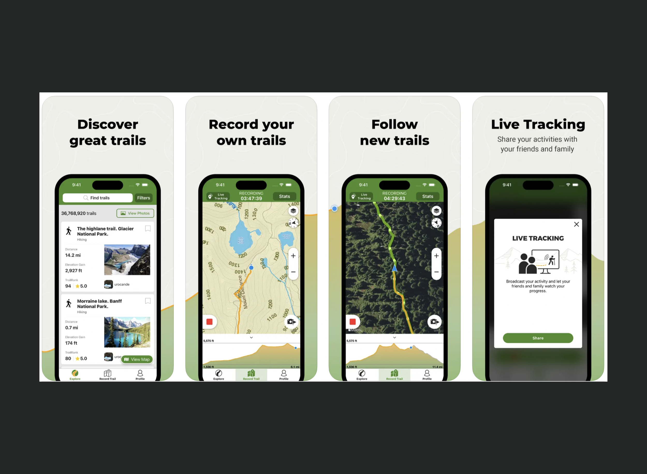
On the home page I decided to get rid of some non-essential UI elements, only leaving the key actions the user is able to take on the app.
For the profile page, I went with a personalized touch where users can upload a background photo of their choice, so it is more visually appealing but also gives the possibility of rotating within beautiful pictures taken on the trails. I also added a few additional categories in a more organized way
More compact trail cards, that include all relevant information but take much less space
Chose a more modern format to present the trail page information

Hi-fidelity wireframes
Here is a breakdown of the redesign changes:


Key Learnings
It is key to do the heuristics of the app to understand what is working and what isn’t
UI is an important factor for the user experience. A well-executed user interface facilitates effective interaction between the user and the app, through contrasting visuals, clean design and responsiveness